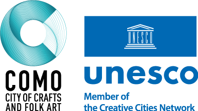
The Graphic Mark
"C"= Como and Creativity
The graphic mark is built around the letter ‘C’, recalling both Como, the city that symbolises textile excellence, and Creativity, the district’s founding value. The main geometric shape is a circle, a direct reference to the circular economy, the cyclical nature of sustainable production and the harmony of design.
The overlapping lines create a texture that represents two key elements; the interweaving of the threads that give life to textiles and the International Network of UNESCO Creative Cities, of which Como is an active member. Seen from above, the logo also brings to mind a cone or bobbin, a symbol of the local textile tradition and craftsmanship.
The chosen typographic style is a homage to rationalist art, consistent with the visual identity of the city. The Pantone Deep Lake colour 18-4834 evokes the shades of Lake Como, creating a visual link between the territory and design.
